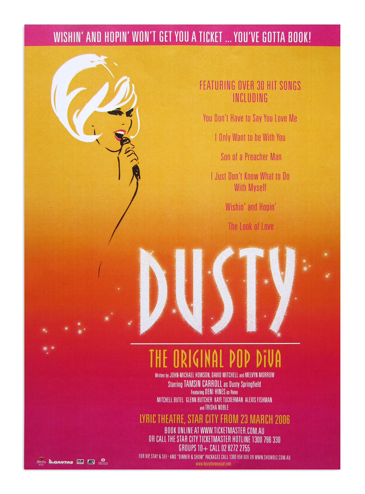
The story behind this beautiful illustration is as enthralling as any theatrical production.
When I was charged with designing a new brand identity for a new musical based on the story of Dusty Springfield, the natural choice was to use her face as she had such a distinctive look. But photos of Dusty didn't cut it in early concepts. My thoughts turned to a graphic, illustrative style: simple and elegant yet iconic.
In pitching my ideas to the producers I recalled an illustrator whose style I greatly admired when I was in college. In my searches on the internet I just happened to find that very same illustrator: Michel Canetti. Better yet (for us), he lived in Melbourne!
So, one of the producers and I met with Mr Canetti and commissioned him to create the hero image for Dusty. He succeeded (you see his original illustrations at left, on grey - exquisite!).
The trouble was - from a marketing point of view - the cool/grey palette simply did not work.
I recall, after many hours - days! - struggling to make it work, in exasperation late one evening I applied the sunset colours in place of the grey background.
EUREKA!
The moment I saw it I knew. I said, to no-one in particular (as I was alone in the studio at that hour): "That's it". And so it was. The producers, everyone loved it... with the possible exception of Mr Canetti, who insisted it was best on the grey.
But what can I say? That's show business!